April 25th, 2012
Marvel has been pushing this year’s big event series, Avengers vs. X-Men, as hard as they’ve pushed anything since Civil War. Three issues in, it’s not surprising to report that the series is . . . underwhelming. Even by the standards of Event Comics. (Whoever thought we’d look back on Civil War as an example of reasonably well-executed, commercialized plot-shifting?)
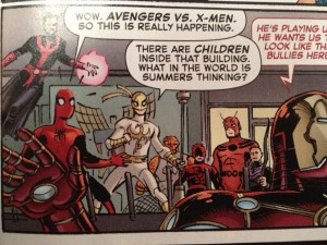
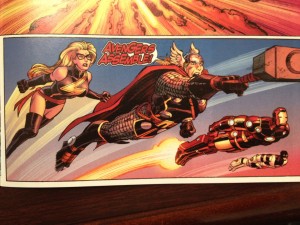
I’m not totally shocked that the writing is stiff and bloated–the thing has five credited writers. But what really has surprised me about the A vs. X books is how embarrassingly sloppy the art is. This is Marvel’s long-gestating, summer mega project and the product that will be there to capitalize on an Avengers moviegoers who decide to try taking a dip into comics. And it features panels like this:
Check out Spidey’s neck there. Click to enlarge and really see how tossed-off those pencils are. Then there’s this:
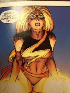
Thor’s face is like, what? And then there’s this Ms. Marvel:
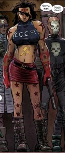
Who looks uncannily like Mother Russia, from Kick-Ass 2:
Look, I get that John Romita Jr. isn’t Alex Ross. He’s not doing hyper-realistic, beautiful oil-on-canvass for each panel. And Romita’s work can be wonderful in its own right. But the stuff in Avengers vs. X-Men looks like he was drawing with a Disney exec was standing behind him with a stopwatch and a meat cleaver.



Kevin Binversie April 25, 2012 at 1:44 pm
You’re actually reading the series Jon? I heard it was okay at best.